Gloss That Tells a Story: Five Stickers with Character
Tags: stickers • design • stationery
Tiny visuals can set the tone for a desk, a laptop lid, or a well-traveled water bottle. A thoughtfully chosen sticker works like a headline: compact, legible, and packed with intent. What separates a memorable decal from the forgettable is often a trio of details—silhouette, palette, and finish. Clean cutlines make shapes read instantly, considered color builds mood, and a glossy surface adds that catch of light that signals care. Below, a five-piece curation demonstrates how small-scale art can broadcast accomplishment, humor, appetite, and seasonality without shouting.
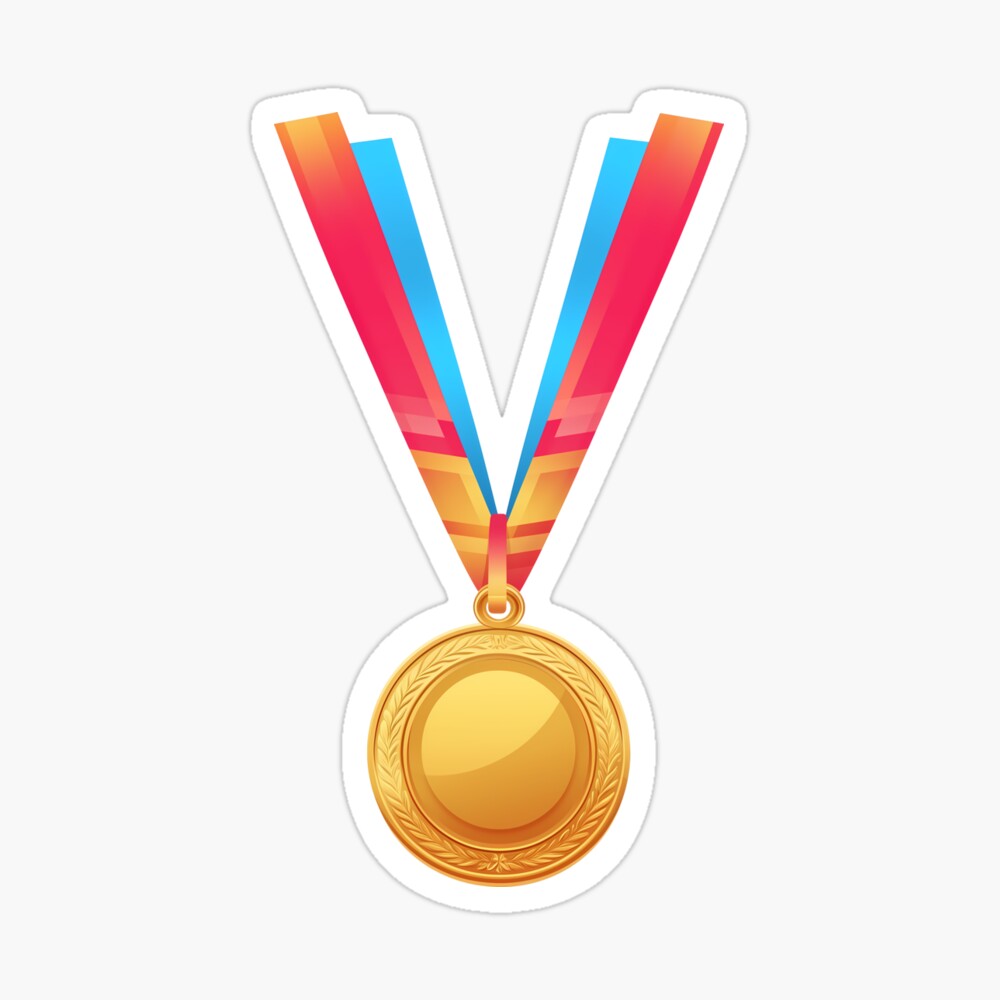
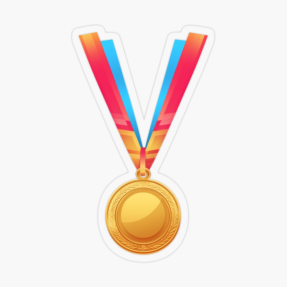
Golden Medal — First-Place Winner
Award iconography has a universal clarity, and this gleaming medallion leans into it with restraint. A polished gold gradient, crisp edging, and subtle laurel cues create a celebratory mark that feels more editorial than overblown. The glossy finish catches highlights like a trophy under stage lights, but the proportions keep it approachable on planners and notebook covers. As a visual shorthand for milestones reached or work well done, it telegraphs triumph in a single glance—no exclamation points required.
First-Place Gold Medal Cockade
Where the medallion is modern, this rosette nods to heritage. Pleated red ribbon radiates from a golden center, recalling fairground ribbons and parade sashes. The symmetry reads cleanly from a distance, while the layered look adds texture up close. Gloss amplifies the metallic warmth and the ribbon’s scarlet pop, making it an ideal emblem for marking standout pages or elevating a gear case with a touch of ceremony. It pairs naturally with the minimalist medal yet holds its own as a classic of celebratory design.
Pattern, Nostalgia, and Play: Four iPhone Tough Case Designs That Wear Personality Well
Explore four iPhone tough case designs—from isometric pastries to a retro palm sunset and a heart-shaped floral arrangement—that blend personality with everyday durability.
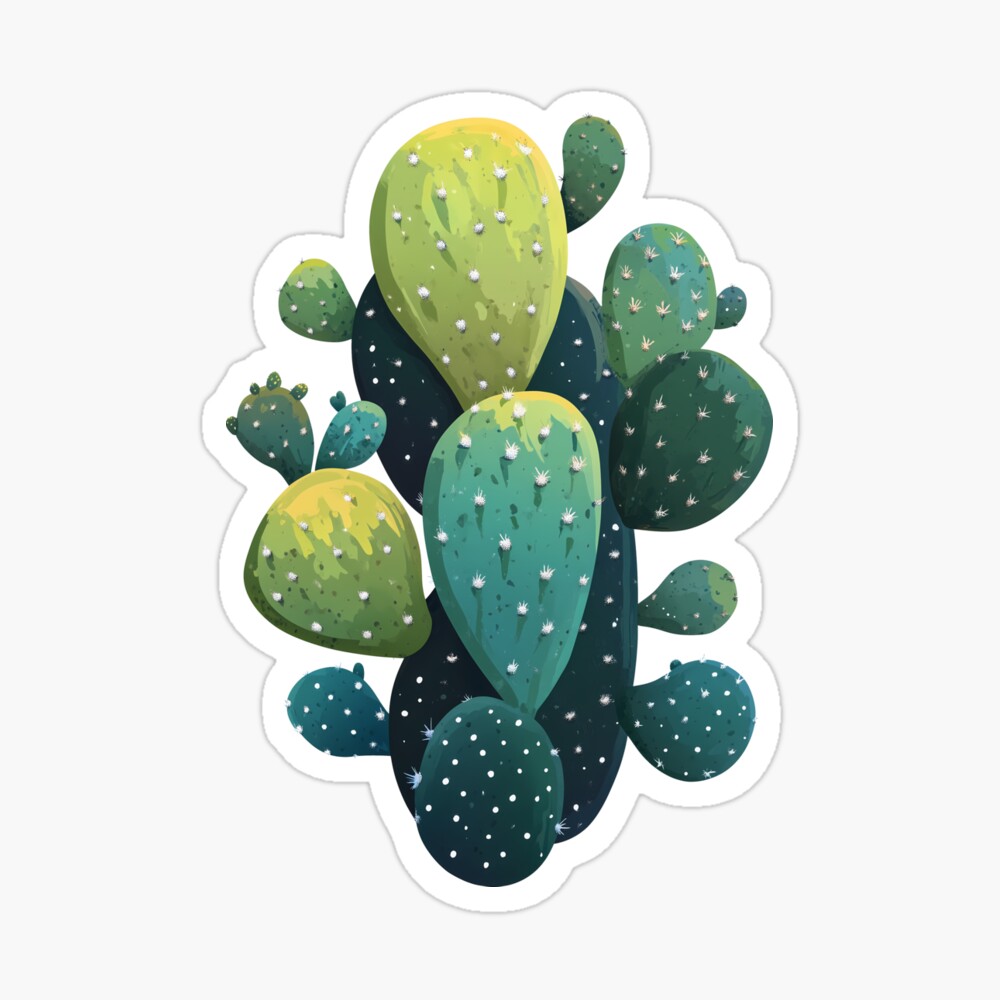
Prickly Pear-fect! Cactus Cutout
Playful without tipping into kitsch, this die-cut prickly pear silhouette trims tight to its pads, giving the piece a lively, organic edge. Fresh greens and dotted spines keep the illustration crisp; the pun in the title supplies a wink for those who spot it. The glossy surface lends a dewy sheen that suits a plant motif, turning everyday tech into a tiny windowsill moment. Ideal for botany fans and color lovers alike, it brings cheer while keeping the palette soothing.

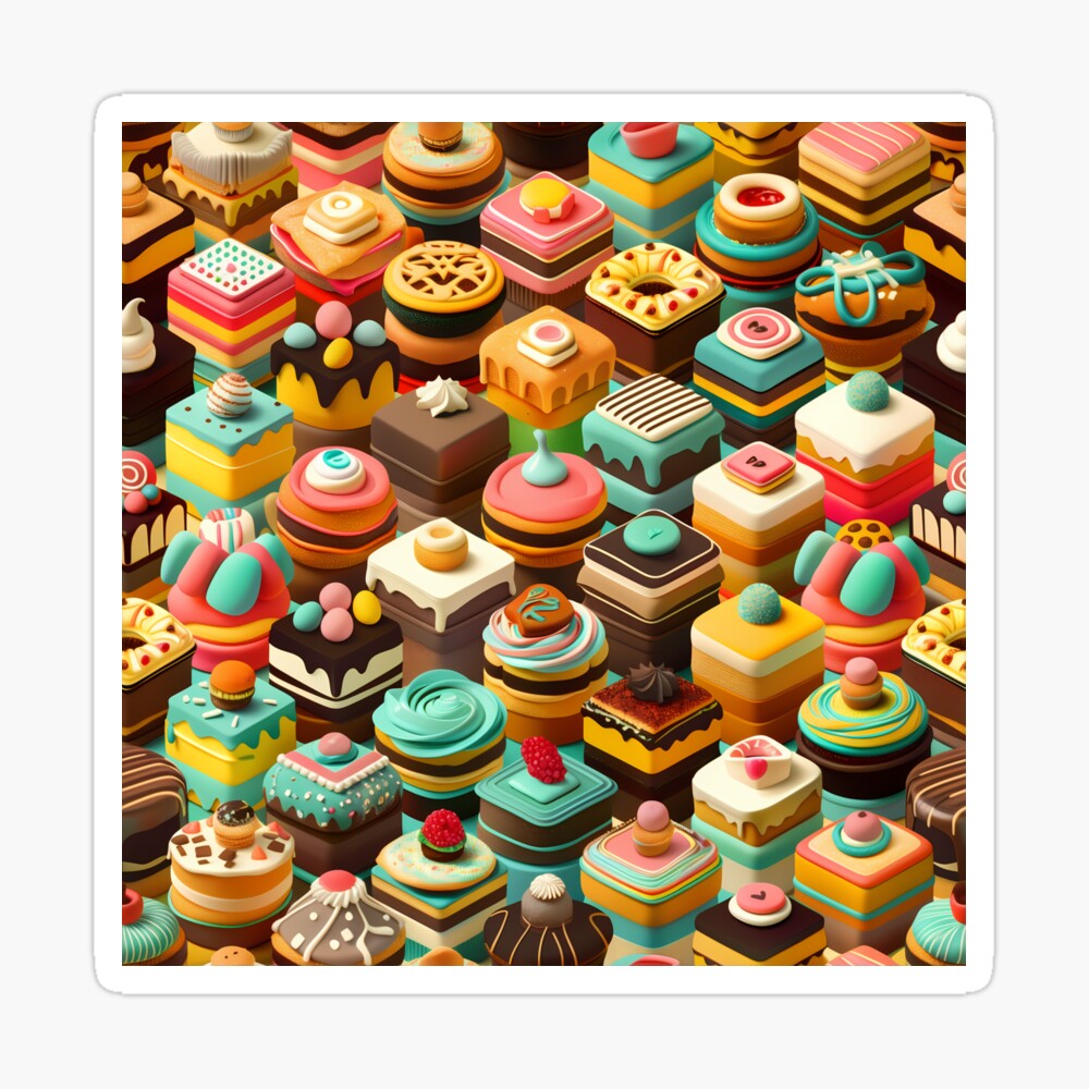
Frosted Isometric Pastries
Bakery meets blueprint in a grid-savvy arrangement of sweets rendered in isometric perspective. Pastel glazes, controlled shadows, and neat geometry give the confections dimensional presence without sugar overload. The gloss layers on a confectioner’s shine, echoing glaze under a bakery case light. It’s a smart, modern take on food illustration—tidy enough for minimalists, enticing enough for anyone who appreciates a well-composed treat. A small square of joy that suggests rewards, breaks, and creative fuel.
A Heart in Bloom: Colorful Florals for Everyday Staples
Discover a heart-shaped floral design across a tank, V-neck tee, mug, stickers, and a drawstring bag. Bright, giftable accents that bring color and warmth to daily routines.
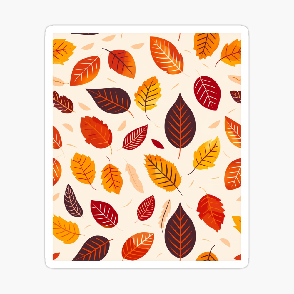
Autumn Leaves — Cozy Fall Foliage Vibes
A rustling mix of leaf shapes gathers into an easygoing composition that feels like a walk home at golden hour. Warm tones—think amber, cinnamon, and russet—do the heavy lifting, while the glossy finish adds a rain-washed gleam that suits the season. Placed on a journal or bottle, the piece functions as a gentle clock for the year, signaling reset and reflection. It’s an inviting way to usher in sweater weather without changing anything but a corner of a surface.