Mood on the Move: Four Samsung Galaxy Tough Case Designs With Real Personality
Tags: tech • design • accessories
A phone case does more than guard edges and corners; it telegraphs taste in a space smaller than a postcard. Color, motif, and texture cues shift how a device feels in hand and how it reads across a table, a coffee bar, or a conference room. These Samsung Galaxy tough case designs lean into that idea with artful surfaces that invite second looks. Each piece balances everyday durability with a distinct visual story, from biophilic calm to confectionery whimsy.

Vertical Garden, Greener Skyline
Inspired by living architecture, this case layers climbing greenery against a city silhouette for a calm, future-forward mood. Soft moss and sage tones meet graphite lines, suggesting terraces and planters that soften steel and glass. It fits right in with minimalist wardrobes and earthy palettes, lending a whisper of outdoors to an otherwise digital day—ideal for anyone drawn to sustainability cues without shouting about them.
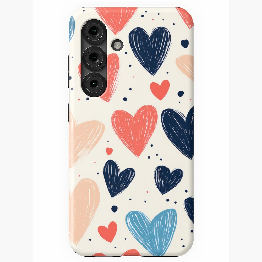
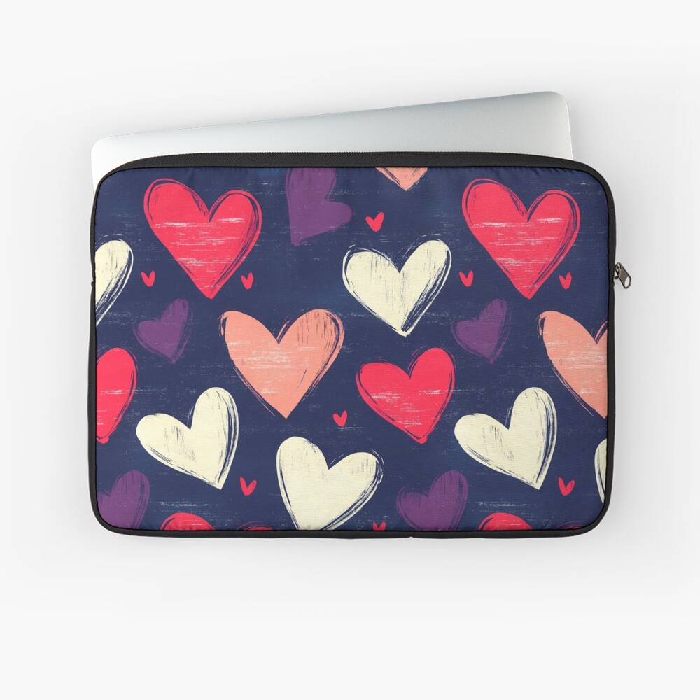
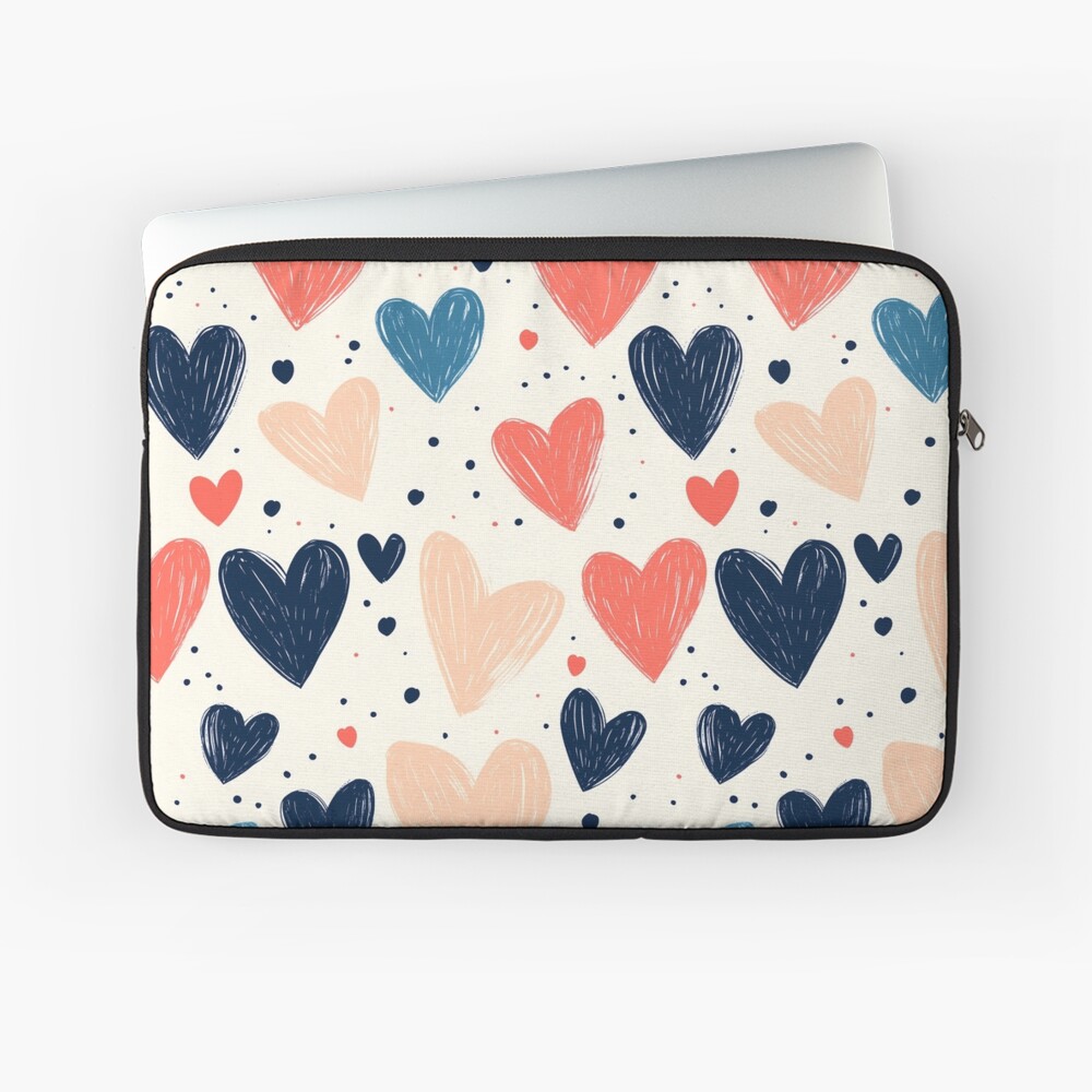
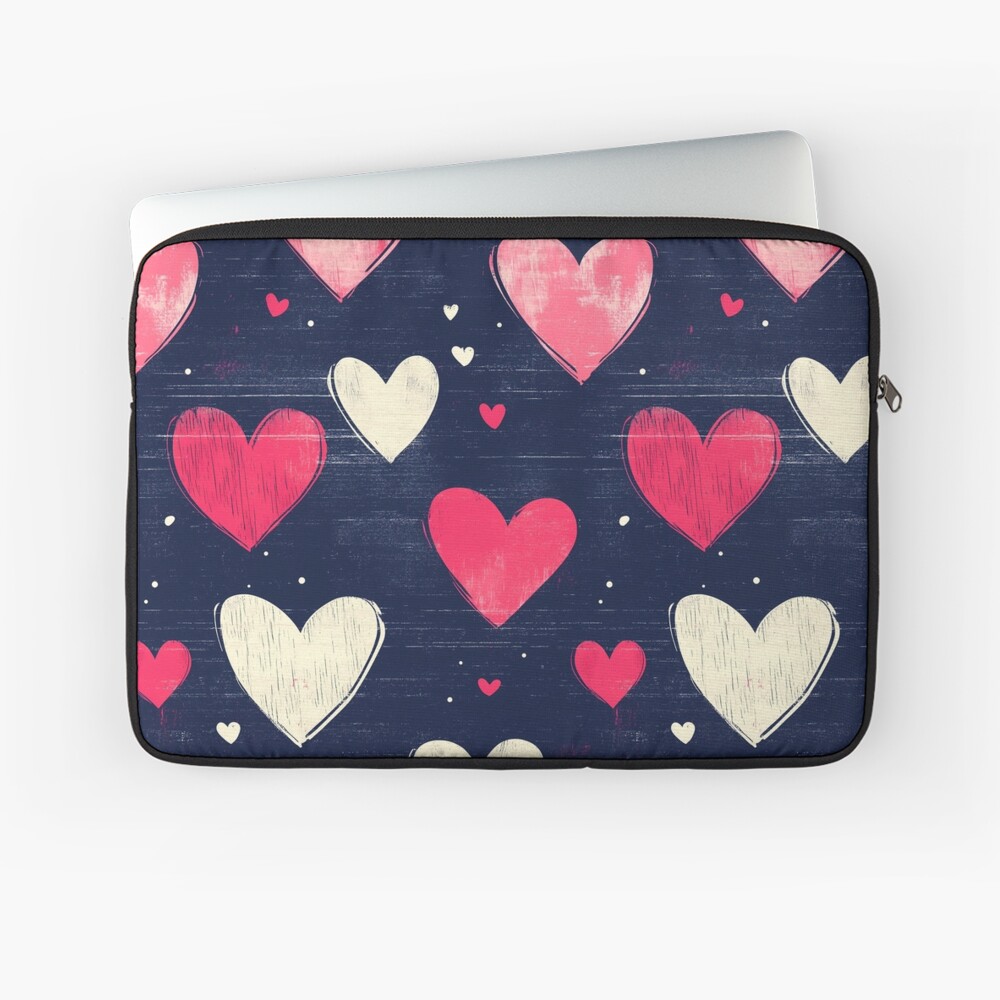
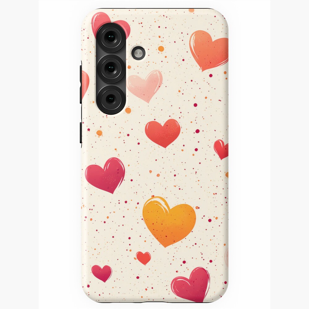
Lovely Heart Doodles, Hand-Drawn Charm
A scatter of sketched hearts gives this cover a notebook-in-the-margin warmth. Imperfect lines and airy spacing keep it playful rather than saccharine, landing somewhere between zine art and stationery chic. It pairs easily with casual fits and weekend routines, adding lightness to the solid, pocket-friendly profile expected from a tough daily companion.
Wearing the Skyline: Urban Layers Inspired by Vertical Gardens
Vertical Garden Eco Friendly Building Green Future: boxy and oversized tees, V-neck, hoodie, and sweatshirt blending urban style with a greener outlook.
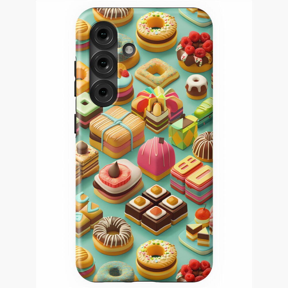
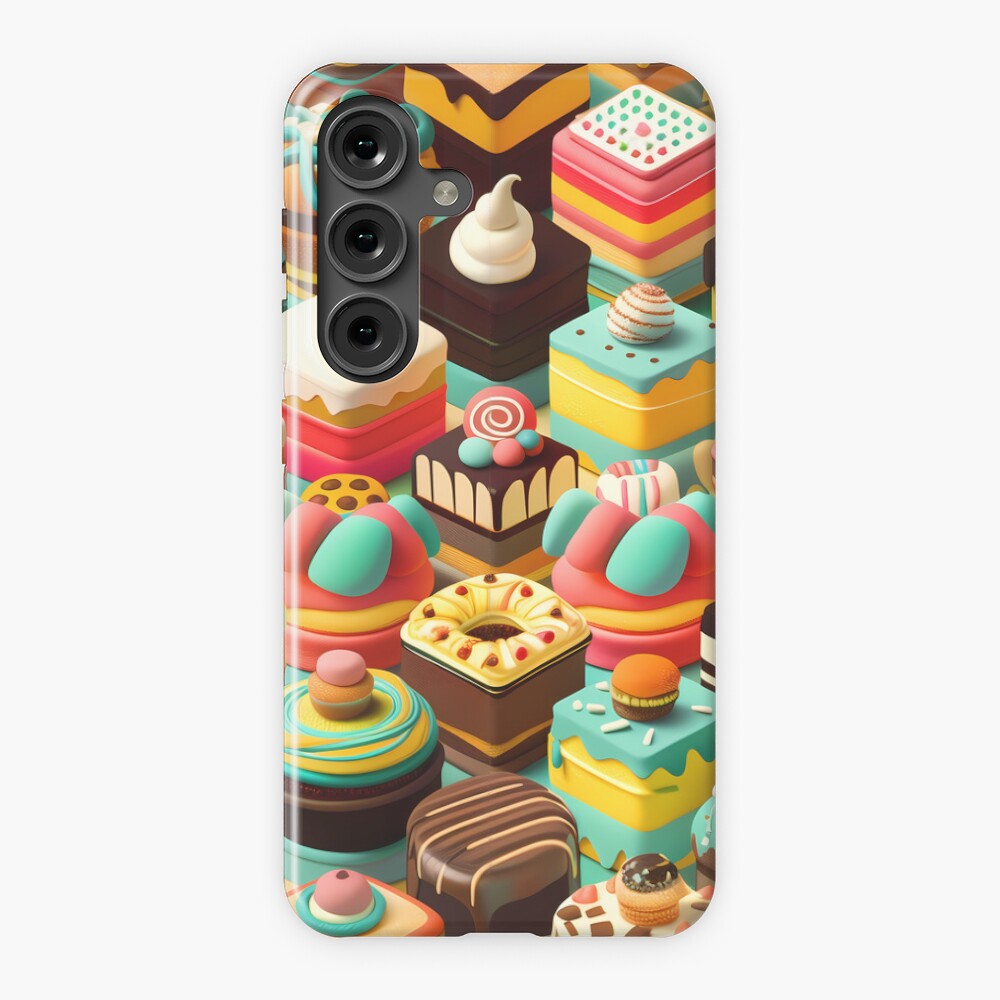
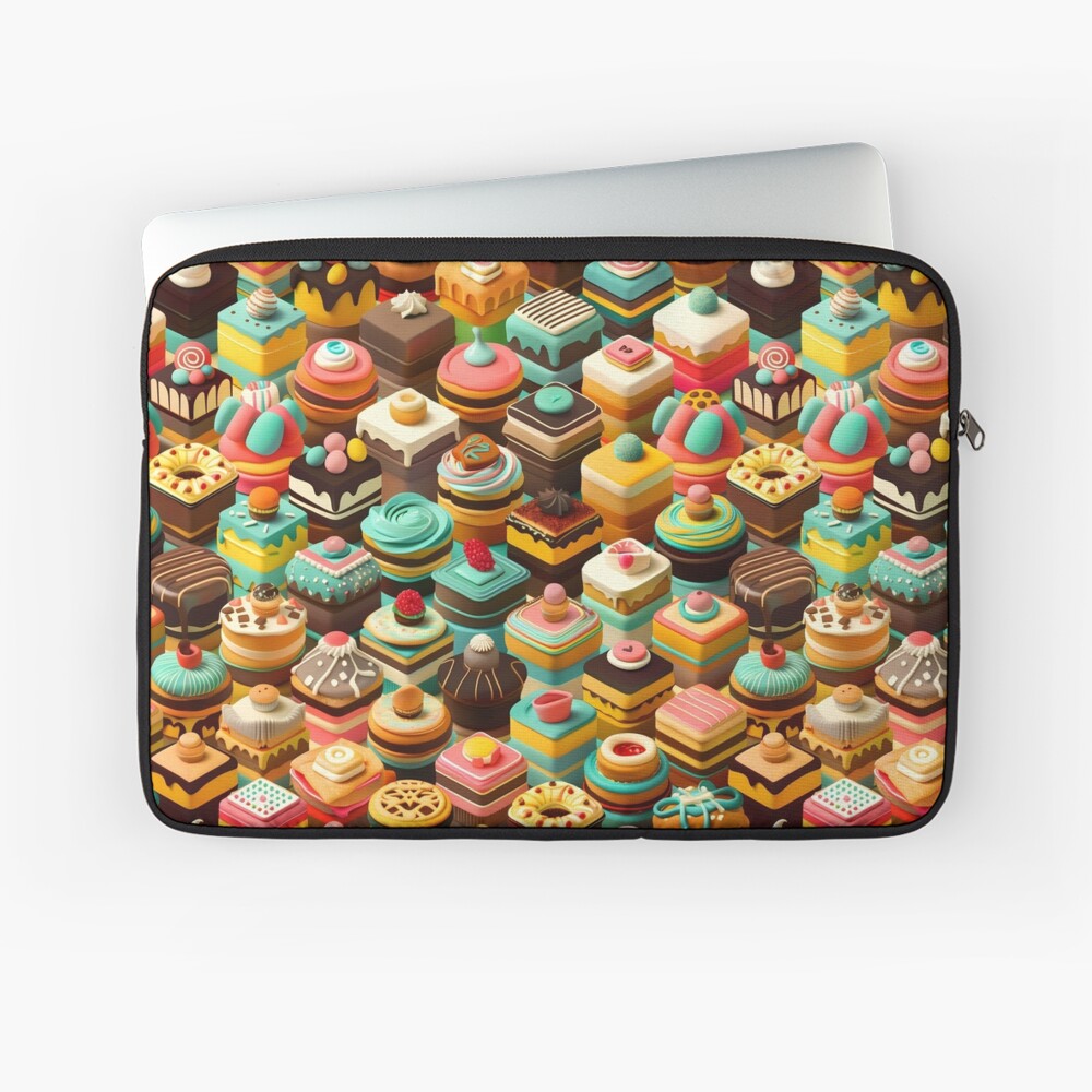
3D Chocolate Pastries, A Sweet Illusion
All the decadence, none of the crumbs. Trompe-l'oeil swirls of frosting and glossy chocolate tones deliver depth that feels almost touchable, while a balanced palette keeps the theme tasteful rather than novelty-loud. It is an instant conversation starter at the cafe counter, nodding to patisserie craft and culinary design trends without overshadowing the phone's clean lines.
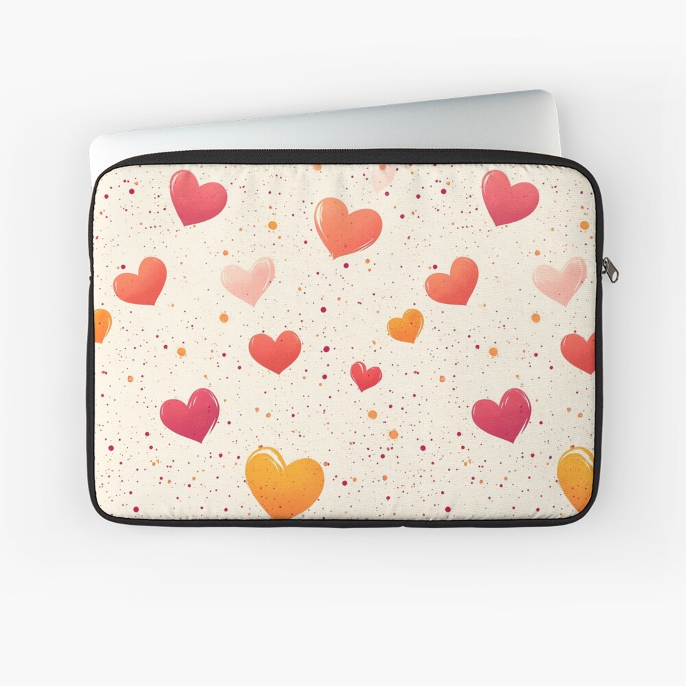
Orange-Red Hearts, Warmth in Motion
Vivid hearts pulse across a gradient that moves from ember-orange to deep crimson, radiating warmth and energy. The composition is bold but controlled, with enough negative space to stay modern. Against darker devices it pops; against lighter finishes it glows. The result is a confident, feel-good statement that still reads refined in evening light.